Chapter 5a: Communicating Environmental Sustainability Visually
“Of all methods for analyzing and communicating statistical information, well-designed data graphics are usually the simplest and at the same time the most powerful.”
-Edward Tufte
Objectives
Students will be able to:
- Analyze how visual design choices (such as color, symbols, and layout) shape perceptions of environmental sustainability in business communications.
- Evaluate the credibility and transparency of visual elements used in sustainability messaging, including certifications and seals.
- Identify greenwashing tactics that use misleading or vague visuals.
- Apply principles of effective visual communication to create sustainable branding messages.
- Assess how cultural, emotional, and design factors impact how audiences interpret sustainability visuals.
Introduction
When you think of business sustainability communication, you might picture detailed reports or long explanations about carbon emissions and resource use. However, for many consumers, investors, and stakeholders, first impressions are made visually. From green packaging and logos to certification seals and website color schemes, businesses rely on visual communication to signal environmental responsibility. Visuals are powerful, but they can also be misleading. This chapter explores how businesses use design choices, color, labels, and icons to communicate (or in some cases miscommunicate) their environmental sustainability.
Visual Design in Business Sustainability
Research in consumer behavior and environmental communication suggests that visual design has a strong influence on how audiences interpret a brand’s commitment to sustainability. You have probably noticed in previous chapters how often companies often use eco-symbols like leaves, trees, and recycling icons to quickly convey “green” values. You may have noticed color plays a role as well: greens, blues, brown, and other earth tones are frequently used to suggest nature and purity, implying values of trustworthiness.
For example, a 2021 NielsenIQ study found that products labeled with third-party eco-certifications (like USDA Organic or Energy Star) were perceived as significantly more trustworthy and were more likely to be purchased than products with unverified claims. This shows how visuals not only inform but persuade, serving as credibility shortcuts. [1]
However, this powerful visual language can also be used deceptively. Greenwashing often takes the form of vague or unverified visuals: leaves added to a logo, meaningless claims like “eco-friendly” without data, or faux certifications that aren’t backed by standards. A 2022 report by TerraChoice found that over 95% of self-described “green” products used at least one misleading visual tactic. [2]
Below is a visual on how visuals express meaning more quickly than in writing:
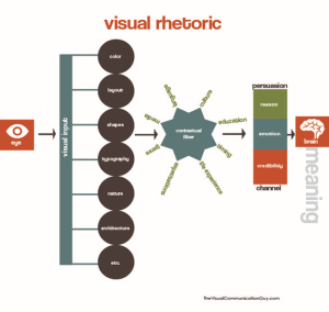
This diagram illustrates how visual elements influence how people interpret meaning, especially in communication such as advertising, branding, or sustainability messaging. It shows the process from what we see (input) to what we understand and believe (meaning).
Step 1: Visual Input (What the Eye Sees)
Visual communication begins with what enters the eye. These inputs include elements like:
- Color (e.g., green for nature)
- Layout (how things are arranged)
- Shapes (like arrows, leaves, or icons)
- Typography (clearly legible font choice, size, and text style)
- Nature and architecture (visual settings or backgrounds of the visual)
- Etc. (any other visual cues in the design)
These elements form the raw materials of visual design. They send quick signals that shape our perception before we even read words.
Step 2: Contextual Filter (How We Interpret Visuals)
After our eyes receive visual input, our brains filter the images through context. This includes:
- Purpose of the message
- Audience (who it’s for)
- Ethics (what’s honest or deceptive)
- Life experience (what we personally know or value)
- Culture (what symbols mean in our society)
- Situational factors (where and how we encounter the message)
This filtering stage explains why different people can interpret the same image differently, based on their background and expectations.
Step 3: Meaning and Persuasion (What the Brain Understands)
Finally, after going through the contextual filter, we create meaning in our brain. The message reaches us through a communication channel, and we process it using different methods of persuasion, such as:
- Reason (logic, facts, data)
- Emotion (feelings, empathy)
- Credibility (trust in the source)
These persuasive strategies determine how much we believe or are influenced by what we saw. In the case of sustainability visuals, for example, a green logo might create trust (credibility), a photo of wildlife might evoke concern (emotion), and a certified label might show data (reason).
Credibility and clarity are essential. Clear labeling, use of SMART goals, transparent infographics, and meaningful certifications help companies build trust. Poorly designed visuals or unsubstantiated icons can backfire, damaging brand reputation. In contrast, visuals that clearly explain progress toward goals, emissions reductions, or sustainability investments—supported by third-party validation—are more likely to earn stakeholder confidence.
Common Types of Business Visuals
Below are examples of visual formats frequently used in environmental business communication. Each one contributes to meaning and message clarity in different ways. Whenever possible, visuals should be clear, labeled, culturally sensitive, and backed by data.
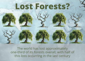
Picture Graphs
A picture graph (or pictograph) uses icons or images to represent data quantities. They’re especially effective for simple comparisons or broad audience understanding.
Example: Below is a photo asking “Lost Forests?” and three out of ten trees dried up. Below the ten trees it says “The world has lost approximately one-third of its forests overall, with half of this loss occurring in the last century.” [3]
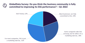
Pie Graphs
Pie graphs show percentages of a whole. They help communicate resource breakdowns or emissions sources. Below’s example is a circle divided into four sections in shades of blue. It is titled “GlobalData Survey: Do you think the business community is fully committed to improving its ESG performance?—Q1 2022.” The largest is on the bottom left, saying “for most companies, ESG is just a marketing exercise, 32%”, then on the top left it says “Don’t know, 22%”. The top right says “Most businesses are fully committed to ESG, 19%”, and the bottom right says “Some companies take ESG seriously, but for others, it’s a marketing exercise, 28%”.
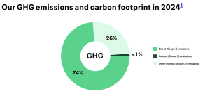
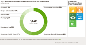
Donut Chart
A donut chart is similar to a pie chart but a circle showing the proportions of different categories as segments of a ring but with a blank center that displays a total value or key message. [4] ESG and other sustainability reports often display these instead of pie charts to display more information more easily. Below is United Airline’s carbon footprint in 2024:
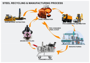
Flow Charts
Flow charts show step-by-step processes. In sustainability, they often explain production processes or supply chain impacts. The example below illustrates the circular process of steel recycling and manufacturing using labeled images and arrows. It begins with raw material extraction, shown with construction equipment. The extracted materials are sent to steel production, depicted with molten steel and factory imagery. The steel then goes to processing and distribution, represented by transport trucks. From there, it’s used in manufacturing, where factory equipment is shown producing goods. These become consumer goods, illustrated with a shopping cart full of steel products. After use, products are collected for brown recycling (industrial recycling), pictured with a metal-sorting claw. This recycling creates pre-consumer steel scrap, which re-enters the steel production process, completing the cycle. Orange arrows between each stage emphasize the continuous, circular nature of the system.
Schematic Diagrams
Schematic diagrams use symbols to explain technical systems (like energy grids or water cycles).
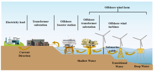
This diagram shows the flow of electricity from offshore wind turbines to land-based facilities, illustrating how offshore wind farms generate and transmit energy. Starting on the right side in the ocean, offshore wind turbines are located in deep, transitional, and shallow water areas. These turbines are connected by submarine cables that carry the electricity they generate to an offshore transformer substation. From there, the electricity flows to an offshore booster station, which increases the voltage for more efficient transmission. The current continues toward shore and reaches a transformer substation on land, then finally flows to the electricity load, which represents factories, homes, and businesses that use the power. Arrows throughout the diagram show the current direction, and the seafloor is labeled with depth zones to indicate how the infrastructure spans from deep ocean to land.
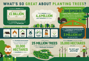
Infographics
Infographics combine text, images, and data to tell a visual story. They’re widely used in sustainability marketing.
In the next image, a visual has a mix of sentences (“What’s so great about planting trees?”) with images, facts, numbers, cartoons, and icons, in mostly green, blue, brown, and white shades.
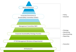
Organizational Charts
These visuals map out responsibility and reporting lines in a sustainability team or governance structure. Below’s example has positions in a business in a pyramid with “all employees” on the bottom, PTTEP Management (divisions and departments) above it, then corporate sustainability strategy function, then management committee (MC), then corporate governance and sustainability committee (CGSC), then board of directors on top. On the right, it says policy and direction next to the top three positions and strategy, monitoring, benchmarking, and reporting next to “corporate sustainability strategy function”, and execution next to “PTTEP management” and “all employees” on the bottom.
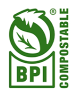
Symbols and Icons
Icons communicate sustainability concepts quickly—like a recycling triangle or a leaf icon. Below is one icon that communicates that a product is certified compostable. It has two leaves opposite of each other pointing at each other in a circle, similar to a yin yang symbol:
Photographs
Photos give visual proof of sustainability initiatives—such as habitat restoration or renewable energy installations. Below is the cover page of Nestle’s sustainability report from 2023 with two women farming in a large area of leaves:

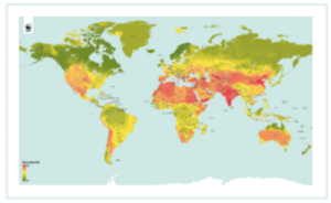
Maps
Maps display geographical data, such as carbon footprint across global operations or water scarcity risk zones. The map here shows red around countries with more water scarcity, shades of yellow for in between, and green for more water secure:
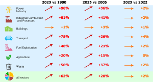
Tables
Tables display structured data and allow for clear comparison of performance over time.
Examples include table comparing year-over-year emissions, energy use, and recycling rates. Below is a table of greenhouse gas emissions of all world countries broken down by sectors. One column is 2023 vs 1990, another is 2023 vs 2005, and the third is 2023 vs 2022. The sectors are power industry, industrial combustion and processes, buildings, transport, fuel exploitation, agriculture, waste, and “all sectors.” All areas have increased from a range of 1-96%.
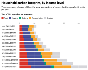
Bar and Column Graphs
Bar/column graphs compare performance over time or between categories (e.g., emissions by product line). Below is a bar chart comparing household carbon footprint by income level. The average carbon footprint of the wealthiest households is over four times that of the poorest. [14]
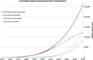
Line Graphs
Line graphs show trends over time. They can track progress toward sustainability or trends that need attention. Below is a chart showing the increase of cumulative plastic waste and disposal from 1950 with one line labeled “primary waste generated,” one line is “all waste discarded,” one is “all waste incinerated” and one is “all waste recycled.” All lines increased significantly in 2020 and predicted to continue in 2050.
Placing and Formatting Visuals for Clarity and Impact
Visuals do more than decorate; they help audiences organize information, guide the reader’s eye, and emphasize key ideas. The placement and formatting of visuals directly affect how well the message is understood. A strong sustainability graphic can enhance credibility, but only if it’s designed and positioned effectively. This section will cover where to put visuals, what kind of font to use, and how to decide what color to make them.
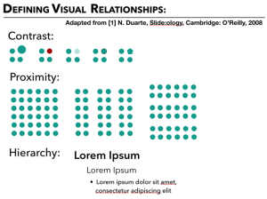
Visual relationships are defined by contrast, proximity, and hierarchy (Duarte, 2008). These design principles help audiences understand which information is most important, how ideas are grouped, and where to focus first. For example, visuals with high contrast—such as bold color or size differences—stand out and draw attention. Grouping items closely together (proximity) helps viewers see patterns. Hierarchy refers to arranging visual elements in a clear order of importance, such as using larger fonts, bold typography, or brighter colors for the main idea. A visual of each is below:
When placing visuals, consider layout and spacing. Avoid clutter. Use negative space (empty space around visuals and text) to give your audience’s eyes a break and emphasize important elements. Place key visuals near the related text to avoid confusion, and consider a sensible order such as largest-to-smallest, chronological sequence, or alphabetical listing when grouping items. Below are two images of a pie chart and statistics on “social customer service.” The left hand side says “Wrong” and the right hand side says “Right” as though they have a first draft and second draft of a website. The left side has many inconsistent fonts in red and yellow (hot) colors on white background. Some text has white on red background and one has red on yellow background. Some of the information is overlapping the other. The right hand side says “Right” and has consistent font, black text on white background, and text on the top, left, and right hand sides for easier skimming and reading.

Juxtaposition is a design technique where two contrasting images or elements are placed side by side to highlight a difference or provoke thought. In environmental sustainability communication, juxtaposition is often used to create emotional impact or raise awareness by visually comparing the consequences of action versus inaction.
Below is a pink sign with white text that says “Pretty.” Then has a cup, then next to it, says “Rubbish.” “Pretty rubbish” sounds like an oxymoron, so it was a creative ad about a cup made from waste, designed to last long and be recyclable.
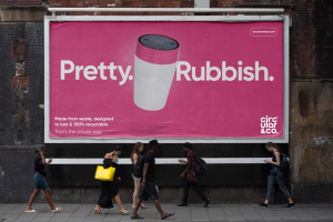
When used carefully, juxtaposition strengthens persuasive messaging and adds depth to sustainability communication. If not done carefully, designers could send the wrong message or a mixed one. For instance, consider going to a website to read an article about the environmental impact of air travel, featuring sobering facts about aviation emissions and climate change. Directly next to the article, automated banner ads promote an organization’s luxury vacation packages and deals on airline tickets. Audiences may perceive this inconsistency as tone-deaf or ironic, which can damage the organization’s reputation. In some cases, it may even result in public ridicule or viral mockery, turning the visual into a meme that might spread across the internet for the wrong reasons. Careful alignment between visuals and context is essential to ensure the intended message is respected and understood.
Typography also plays a major role. Headings and callouts should be legible and consistent. Font size, weight (boldness), and style (serif/sans serif) all influence tone and readability. Choose typography that matches your message—for example, bold modern fonts for innovation, or clean minimalist fonts for eco-friendliness. Notice the difference between this textbook’s font, plain and readable for communicating information, compared to the font below, which is a black banner that says “Sustainability is a responsibility” in cursive, using orange, then red, then yellow:
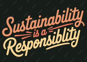
Cursive, creative fonts can show friendliness and casualty, which may make a professional appear more approachable. It can also show lack of seriousness in a topic.
Use of Color
Using color carefully can help draw readers to your message and make it easier on their eyes. Recall the color wheel for what is complimentary and supplementary below.
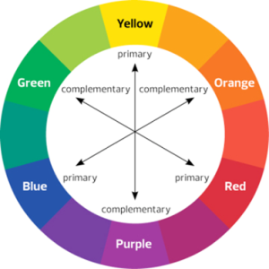
The primary colors—red, yellow, and blue—have complementary colors on the opposite side of the color wheel: green, purple, and orange, respectively. These combinations create contrast, but not all are visually accessible. For example, although red text on a yellow background may appear bold, it can strain the eyes and reduce legibility due to low contrast. Hot colors like red, orange, and yellow can energize but also overwhelm the eyes. In contrast, cool colors like blue, green, and purple are calming and generally more comfortable for the eye, especially when visualizing data.
Neutral colors such as black, white, gray, and brown serve important functions in design. They help create negative space (the empty area around design elements) and can emphasize contrast, support typography, or suggest professionalism and clarity. Designers should aim for high visual contrast—especially between text and background—to ensure accessibility. For example, readers with color vision deficiency would get a headache trying to read green text on a red background (for red-green color deficiency) or blue on yellow (for a less common vision deficiency) or vice versa. Anyone using a black-and-white printer would not be able to decipher certain colors easily, so for formal reports that may be printed, it is best to use patterns (e.g., polka dot on one half of a pie chart and stripes on the other half) instead of colors. Below is an example of using a bar chart with a variety of patterns in black-and-white for each category.
Proofreading Visuals Carefully
Once you’ve selected or created a visual and determined the most effective way and place to display it, the last step is fine-tuning the final details. The following tips will help you polish your visual for maximum clarity, impact, and alignment with your sustainability message.
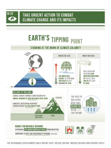
Be Consistent. Using the same font, color, design, etc. can show intention in your message. Refer to chapter 2A for the UN’s Sustainable Development Goals and recall that each goal has a specific shade of a certain color, but all the goals have the same font in mostly all caps. Below is goal number 13, climate action, in dark green in most text, contrasted with white and sometimes grey.
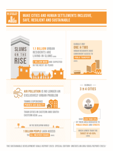
By comparison, goal 11 is dark orange, but still uses white and sometimes grey for contrast. The font is the same and most text is in all caps:
The SDG’s consistency in design is important to understand not only for copyright but for when readers refer to a company’s sustainability report, the professional writer can save time explaining how each of their accomplishments have achieved a UN SDG by putting its logo in the report. See the example below from Nestle’s “Creating Shared Value Sustainability Report” from 2023. The SDGs are alongside their donut chart:
Use Green as Appropriate. As you can likely tell already, many companies use the color green when expressing environmental sustainability. However, overuse of green may dilute its meaning or seem performative. Below is an example of Coca Cola using green in an advertisement saying “sweetness from natural sources, lower calorie”:
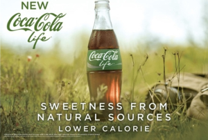
Coca-Cola faced criticism for greenwashing after releasing ads that featured the color green, implying environmental responsibility without making substantial changes to their sustainability practices. Critics argued that the use of green, a color commonly associated with nature and eco-friendliness, was a visual tactic to suggest environmental commitment while continuing to commercialize fresh water sources and produce large volumes of plastic and high-emission products. This strategy, relying on color symbolism rather than credible action, misled some consumers into believing Coca-Cola was more sustainable than it actually was. [25] Choose color intentionally and carefully to represent your message such as with data categories, goals, achievements, or before-and-after comparisons.
Cite and label visuals you borrowed. Use labels on all visuals and cite the source of any data presented. Make sure charts and diagrams follow a logical flow and are formatted consistently across your report, website, or presentation. Using the black-and-white bar chart from above, below is an example of adding a caption:
In short, effective sustainability communication in visuals should be:
- Accurate
- Consistent
- Simple
- Well-labeled
- Such as by adding a caption or title
- Logically organized
- Such as chronological, alphabetical, largest to smallest, etc.
- Strategically placed
- Culturally and visually accessible
Meanwhile, effective sustainability communication in visuals should NOT be:
- Misleading, inaccurate
- Inconsistent, confusing
- Overwhelming with information, text, etc.
- Organized or juxtaposed poorly
- Culturally insensitive
- Visually unappealing
- Such as two hot colors on top of each other or hard for audiences with color blindness
When these elements work together, visuals not only communicate a company’s sustainability efforts—they make them more believable.
[1] Sustainability Connects Retailers Brands with Conscientious Consumers. (2021). Nielsen IQ. From https://nielseniq.com/global/en/insights/report/2021/sustainability-connects-retailers-brands-with-conscientious-consumers/
[2] TerraChoice. (2010). The Sins of Greenwashing.
[3] Global Deforestation Impact Pictograph. Presetermedia. From https://www.presentermedia.com/powerpoint-clipart/lost-forest-pictograph-pid-30899
[4] What is a Donut Chart? (n.d.). Spotfire. From https://www.spotfire.com/glossary/what-is-a-donut-chart
[5] Corporate Impact Report. (2024). United Airlines. From https://corporateimpact.united.com/environmental-sustainability/illustrative-roadmap-to-net-zero/
[6] Elemure, I., Dhakal, H. N., Leseure, M., Radulovic, J. (2023). Integration of Lean Green and Sustainability in Manufacturing: A Review on Current State and Future Perspectives. Sustainability, 15(13), 10261. https://doi.org/10.3390/su151310261
[7] Su, X., Wang, X., Xu, W., Yuan, L., Xiong, C., Chen, J. (2024). Offshore Wind Power: Progress of the Edge Tool, Which Can Promote Sustainable Energy Development. Sustainability, 16(17), 7810; https://doi.org/10.3390/su16177810
[8] Infographic: What’s so Great about Planting Trees? (n.d.) Forestry.gov. From https://www.forestry.gov.scot/publications/550-infographic-what-s-so-great-about-planting-trees
[9] Sustainability Governance Structure. (n.d.). PTTEP. From https://sustainability.pttep.com/en/our-sustainability/sustainability-governance-structure
[10] A Guide to Packaging Logos and Labels. (n.d.). Solinatra. From https://www.solinatra.com/news/packaging-labels-composting-recycling
[11] Creating Shared Value and Sustainability Report. (2023). Nestle. From https://www.nestle.com/sites/default/files/2024-02/creating-shared-value-sustainability-report-2023-en.pdf
[12] Sustainable Business Group. (2015) The State of the Apparel Sector 2015 Special Report: Water. From http://glasaaward.org/wp-content/uploads/sites/4/2015/05/GLASA_2015_StateofApparelSector_SpecialReport_Water_150624.pdf
[13] GHG emissions of all world countries. (2024). European Commission. From https://edgar.jrc.ec.europa.eu/report_2024
[14] Song, K., Qu, S., Taiebat, M., Liang, S., Xu, M. (2019). Scale, distribution and variations of global greenhouse gas emissions driven by U.S. households. Environment International, 133, Part A, 105137. ISSN 0160-4120, https://doi.org/10.1016/j.envint.2019.105137.
[15] Copyright © 2017 The Authors, “Production, use, and fate of all plastics ever made,” some rights reserved; exclusive licensee American Association for the Advancement of Science. No claim to original U.S. Government Works. Distributed under a Creative Commons Attribution NonCommercial License 4.0 (CC BY-NC).
[16] Duarte, N. (2008). Slide:ology: The art and science of creating great presentations. O’Reilly Media.
[17] Crooks, R. (n.d.). 20 Graphic Design Tips to Enhance Your Visual Content. HubSpot. From https://blog.hubspot.com/marketing/tips-designing-effective-visual-content-infographic
[18] A Pretty Rubbish Campaign. (n.d.). One Black Bear. From https://oneblackbear.com/work/creative-advertising-for-sustainable-products/
[19] Freepik. From https://www.freepik.com/premium-vector/sustainability-is-shared-responsibility-inspiring-typography-poster-environmental-awareness_396256210.htm
[20] https://www.peachpit.com/articles/article.aspx?p=2162084&seqNum=2
[21] Milošević, M., Selim, A., & Milošević, D. (2016). SUSTAINABILITY AND QUALITY COSTS IN THE HIGHER EDUCATION INSTITUTIONS. Safety Engineering, 6(2) DOI:10.7562/SE2016.6.02.03
[22] Take urgent action to combat climate change and its impacts. United Nations. From https://sdgs.un.org/goals/goal13
[23] Make cities and human settlements inclusive, safe, resilient, and sustainable. (n.d.) United Nations. From https://sdgs.un.org/goals/goal11
[24] https://thesustainableagency.com/blog/greenwashing-examples/
[25] Watson, L. (2018). The deceptive green: How color cues mislead consumers on sustainability. Journal of Environmental Marketing, 12(3), 45–58.